MAPPING YOUR SETTINGS
MAPPING YOUR SETTINGS

Q: I want to create
a map as large and
as detailed as the map of
Deepearth
on pages 76
and 77 of the DSG. The
blank maps included at the
back of
the DSG use boxes.
that are too large
for mapping at this scale.
Is there
any way around this?
A: Doug Niles rolled
up into a ball and
thought about this one for
a while. When
he unwound himself, he offered
a solution.
Take the most suitable map
in the
back of the DSG (probably
one of those on
page 127)
and enlarge it using a photocopy
machine. Then, take a straight
edge and
draw a vertical line between
each pair of
vertical lines on the blank
map (these new
lines should bisect the
spaces between the
old lines). Do the same
for the horizontal
lines. You have now doubled
the number
of spaces available for
your subterranean world.
(118.58)
Most DMs have developed a fair degree of
skill in drawing orthographic maps--
the typical, top-view illustration of
corridors, rooms, doorways, and other features of a dungeon
or other setting.
This type of map, like an
architectural blueprint, shows
exact relative sizes of all areas displayed,
and is very useful for
recording distance && direction.
If more than one level of elevation needs
to be displayed, however,
a separate map must be drawn for each
level. Often, the
exact position of an area that runs through
two or more levels,
such as a stairway
or well shaft, is hard to picture when players or
DMs use an assortment of orthographic
maps.
An alternate technique known as perspective
mapping is
explained in this section. A DM willing
to take the time to learn a
few points, and to photocopy one or more
of the perspective grids <>
in the back of this book, will find that
he can prepare detailed and
attractive 3D maps for multi-level settings
above || below ground.
Basic
Mapping Considerations
An effective map is one that communicates
the necessary
info to the people who will use it. This
can often be
accomplished in a few minutes with a pencil
and some scratch
paper.
However, if you have the {time} &&
interest to create attractive,
easily legible maps that accurately convey
a great deal of detail
about your setting, a little more care
is called for. Buy or borrow a
few tools, such as
a straightedge, compass, protractor, and a
template or two. You may also wish to
use a felt-tip or razor-point
pen for drawing, since these make a line
slightly thicker than the
underlying grid. These mapping aids can
greatly improve the
appearance and legibility of your maps.
Perspective
Mapping
Perspective mapping has advantages and
disadvantages
compared to standard orthographic mapping.
On the positive
side, a perspective map conveys the 3D
nature of
a setting much more realistically than
an orthogonal map. The
position of each dungeon
|| castle level relative to all of the
other
levels is much clearer, and the connections
between the levels
are easier to see.
On the other hand, perspective mapping
requires a little more
knowledge of technique than orthographic
mapping. Raised features
on a perspective map, such as staircases,
spiral stairways,
platforms, ramps, and any other 3D details
will
obscure the view of areas immediately
behind them. Also, the
smaller squares to the rear of a perspective
grid tend to cramp
your design if used for areas that need
careful attention to detail.
Finally, a perspective map takes more
time to draw than an orthographic
map.
However, if you have the time and dont
mind learning a few relatively
simple techniques, you can create maps
that communicate
much more information than simply how
big a room is, or
whether the door is in the north or the
east wall.
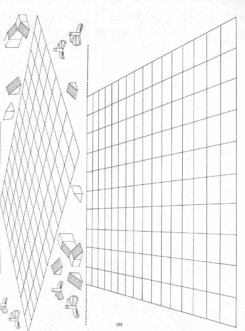
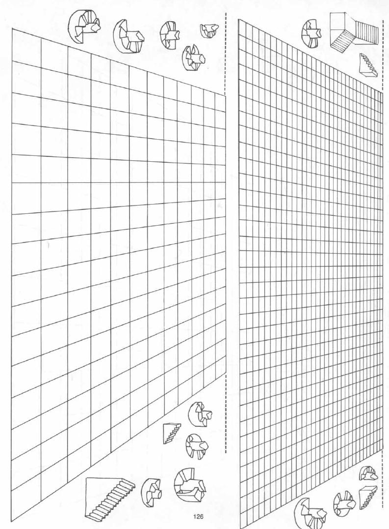
There are two easy ways to start a perspective
map. The first
step in each case is to select a grid
from those provided in this
book. Pick the grid that best displays
the details of your design,
whether it be a castle, tower, dungeon,
or cavern. For example, a
solid, square castle or dungeon requires
one of the square grids
that give approximately equal dimensions
of depth and width. A
longer, narrower grid works better for
a cavern or wall.
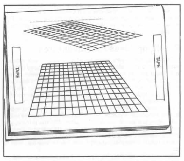
1. The first mapping technique requires
you to make a few photocopies <>
of the grid. Permission is hereby granted
for the photocopying
of these grids for personal USE only.
Make one copy for
each floor or level you need, and consider
making a few extras if
you want to do a really careful job. A
photocopier that makes
enlarged copies can
be very helpful.
2. The second technique requires
you to buy a tablet of tracing <>
paper. You can then trace portions of
the grid on the tracing
paper and draw in the map details. You
can try to hold the tracing
paper in place over the grid by hand,
or you can tape it into place.
Take precautions before taping, however,
or the tape will eventually
tear the pages of the book or lift up
the print. This will not happen
if the tape holding your tracing paper
is taped to transparent
tape instead of the actual book page.
By permanently placing two
short pieces of clear tape on each grid
page, as in the diagram,
you provide places to fasten the tracing
paper without ruining the
page.
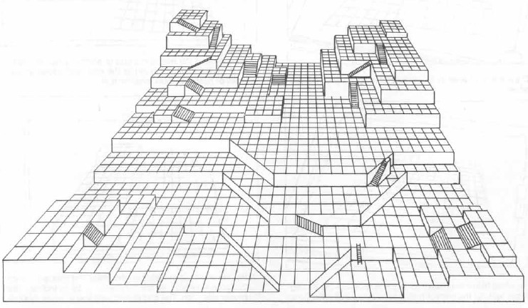
Before you select a grid for your map,
you should think about
the overall shape of the AREA to be designed.
Select a grid that
best matches this overall shape, whether
it is long and narrow or
relatively square. Because raised details
such as stairways
obscure the areas behind them, design
such areas so that they
do not need much detail. For
example, directly behind a tall stairway
you might place a
large, empty room or even an expanse of
solid rock.
Also, because the squares at the rear of
the grid are much
smaller than those in the front, try to
design your most important
and detailed areas toward the front of
the grid. If you like using
raised platforms in your designs, place
those platforms so that
the lower ones are in the front and the
higher ones toward the
rear. It might help to imagine that you
are designing a set for a
stage play, and you want the audience
to be able to see all of the
acting AREA.
Start the design as close to the front
of the grid as possible.
Because the large squares in the front
allow for greater detail,
they should be used for the most intricate
or important areas.
This does not mean that the entrance to
the lair, dungeon, etc.,
has to be placed near the front of the
grid-you might instead
have characters enter the area far to
the rear, and work their way
into the important areas you have detailed
near the front.
If your design has several levels, you
should designate a control
square. This is a single square on the
grid, located roughly in
the center of the area being designed.
It is a good idea to center
the control square under the highest tower
or the midpoint of the
top level of your design. The control
square allows you to line up
the grids for each level, since the control
square on each level is
directly above or below the control squares
on the adjacent
levels.
If each level of your design is approximately
the same shape,
the control square should be the same
square on each of your
grids. If you have made several photocopies
of the grid, simply
hold them up to a light and make sure
all the control squares line
up. If you are using tracing paper to
copy the grid, place a pencil
mark in the control square of the grid
you have chosen in the
book, and then mark that square on your
traced copies.
Once you have established the grid, drawing
a perspective
map is very much like drawing an orthographic
map. The biggest
difference is that the squares making
up the map grid are not true
squares. It may take a little getting
used to, but with practice you
should be able to make perspective maps
as easily as the flatview
variety.
You might find it advantageous to draw
the outer limit of the
design first. This helps you visualize
the overall structure, and
also makes it easier to line up the maps
of the various levels.
Alternatively, you might start with a
huge staircase or centrally
located atrium that includes areas on
several levels.
The symbols that work on an orthographic
map can usually be
translated directly onto a perspective
map. Doors, trapdoors, curtains,
furniture, and many other symbols can
be used just as you
have always used them. The symbols for
certain 3D
objects must be changed slightly, however,
since the
map must portray these objects vertically
as well as horizontally.
Numerous mapping symbols for these 3D
objects have been printed beside the map
grids. You can photocopy,
trace, copy, or cut and paste these onto
your maps. Several
different styles of symbology are presented,
from very simple
types to more elaborate and artistic designs.
You may find it easiest
to use the more basic symbols when you
start out, but you will
probably be surprised at how quickly you
develop the necessary
familiarity to deal with all of these
designs.
When an AREA is designed, and particularly
in the case of an
underground environment
that does not rest on level ground, you
may wish to mimic minor changes in altitude
by cutting your grid
into the appropriate pieces and shifting
the individual pieces up
or down slightly.
Different techniques for splitting the
grid are described in stepby-
step fashion below.
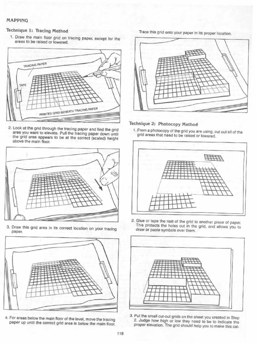
(continued, from 3, above)
-^-culation. For example, if each square
equals 10 feet, and you
want the platform to be 20 feet above
the main floor, simply measure
a nearby square and put the platform grid
twice that distance
above the cut line.
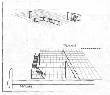
Each sample grid in this book includes
a horizon line.
The purpose of the horizon line is to
help you to view the grid correctly.
In order to correctly orient the grid,
turn it so that the horizon line is horizontal, or level.
The horizon line can also help you to draw
vertical lines on the grid.
Pillars, staircases,
ladders, and other primarily vertical objects should not look as if they
are about to topple.
With a F square, or with a triangle that
includes a 90-degree angle, you can use the horizon line to accurately
draw vertical lines.
If you wish to draw a vertical line, simply
make sure that it is perpendicular to the horizon line.
In a typical campaign world, the DM does
not have {time} to prepare detailed maps
of all the regions that the PCs are likely to visit.
The problem can sometimes be alleviated
by mapping only those areas that will be needed in the immediate future,
but since the PCs actions are often unpredictable,
it can be difficult to determine which way they will go next.
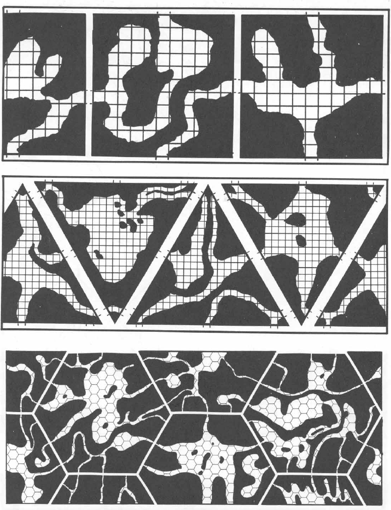
Geomorphic maps, which are particularly
applicable to underground
settings, present another solution to
the problem. Geomorphic
maps are a series of maps created in the
same shape
&& size, with standardized entry
and exit points at various locations
around each maps edges. A geomorphic
map can be
altered so that any one of its edges abuts
a neighboring
geomorph; consequently, a tremendous #
of combinations
can be created. The advantage to geomorphic
mapping is that
you do not have to map out every square
foot of a massive region.
Instead, you use a combination of geomorphs
to create the areas
needed. Areas that are particularly well-suited
for geomorphic
mapping include most underground settings,
and large cities or
sprawling fortresses on the surface.
A single geomorphic map section should
not be designed to
portray a whole setting. Ideally each
section should create only a
small part of the entire AREA. Then you
can assemble the
geomorphs like the pieces of a puzzle,
and eventually design an
entire, vast AREA, one section at a {time}.
Also, a geomorphic block
may contain several separate adventure
areas; you need not USE
all of these areas.
Geomorphic maps can be created as squares,
equilateral triangles,
or hexagons. Squares are the easiest to
use. Whatever
your choice, all of your geomorphs must
be drawn in the same
shape so that they will fit together.
After you determine this
shape, you need to decide what the scale
of your maps will be,
and how many possible points of connection
you will have on
each side.
Triangular geomorphs are limited in that
each map has only
three possible orientations when placed
into a design. Thus, the
number of geomorphs needed is larger than
it is with the other
types, unless you want to repeat the patterns
a great deal.
Hexagonal geomorphs have the greatest
number of potential positions,
but are also slightly more complicated
to draw.
Many mappers consider the square geomorph
to combine the best features of all types.
When you begin to design your geomorphs,
plan how many
possible connections you wish to have
between each map section
and its neighbors. This does not mean
that each geomorph
connection must lead to a through-way,
but it allows you to provide
for plenty of route options.
The scale of your maps should influence
the# of connecting
locations you have on each geomorph. If
each map section
represents a 60 x 60-foot square, you
will probably want no
more than two, and perhaps only one, potential
connection per
side. If the geomorph represents a square
mile of an underground
realm, you
may wishto have as many as six or eight
potential connections on each side of
the map.
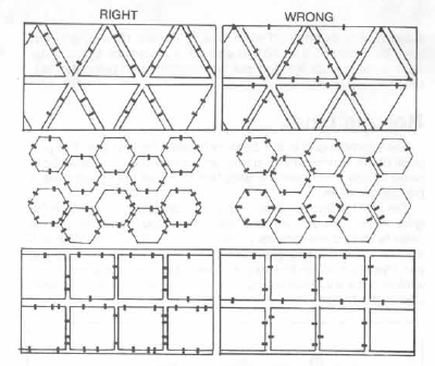
The various types of geomorphs, and notations
for marking the
access and egress points on each, are
diagrammed here.
The connections between maps must occur
at a standardized
location on the sides of each geomorph.
For example, you might
have a connection occur in the exact center
of each side, or
include a pair of connections that are
each 1/3 of the distance in
from the edge of the geomorph. Measure
your distances carefully,
since this determines whether or not your
maps line up
properly. Whatever pattern of connections
you use must be symmetrical
to both left and right, or you will not
be able to line up the
map sections.
Once you have established the basic parameters
of your
geomorphs, you can begin to draw as many
maps as you have
the time and interest to do. Each map
should be drawn to the correct
shape and scale.
Although you do not need to make sure that
every possible
connection on each geomorph leads somewhere
(Le., does not
dead-end), at least 75% of them should
provide a means of entry
into another map section. A greater number
of dead-ends dramatically
increases your chances of enclosing whole
sections of
your dungeon and making entry and exit
almost impossible.
Once you have a collection of geomorphs,
you are ready to randomly
generate an AREA
of potentially huge proportions. Of
course, this procedure does not have to
be random--if you feel
that a certain map section would be ideal
for a particular location
in your campaign setting, by all means
put it there. For the most
part, however, you can generate the overall
map of your setting
by making a few die rolls and varying
the placement of your
geomorphs.
You might start by numbering each geomorph
and rolling dice
to determine the placement of each geomorph.
To begin mapping,
roll a die and start with the geomorph
with that number on it.
A geomorphic map section can be placed
in any one of a num-
ber of positions. The number of positions
equals the number of
sides of each map section, so a triangular
section can be placed
in one of three positions, a square in
one of four positions, etc.
Roll a die (a d3, d4, or d6, as appropriate)
to determine which face
of the geomorph is north.
Once you have placed a geomorph, treat
it as a normal part of
your setting map. Allow the PCs to explore
it and map it as they
normally would. If they reach an edge
of the map section, simply
roll a die again to pick a new geomorph
to add to that edge, and
then roll to determine that geomorphs
orientation (which side is
north). If a connection between the two
matches up, as it usually
will, the PCs can proceed without learning
that they have moved
onto another map section. If the connections
do not line up, the
party simply wanders into a dead end,
and has to find another
path.
By using a variety of geomorphs and making
sure that they are
placed in many different orientations,
you can create a huge
region of well-mapped terrain,
and your players will never know
that they are passing through many of
the same map sections
that they have previously explored.
